Posts

Showing posts from October, 2021

Basement Plans for the TV Area

Image
When Hurricane Ida rolled through, it dumped more rain then the gutters could handle, and therefore dumped rain into a window well and that dumped into our basement. So guess what?! I've got to come up with a plan for the basement ... years before I thought I'd need to. But, here where are. Thanks IDA :/ The basement is pretty chopped up, so let's start with the TV-watching area, as that's the most important to my family and where all of the damage took place.  And here's the plan: First, we need to move the 1,000 lb pool table that you can see peeking just around the corner. That's going into the former gym area where I painted the rainbow mural. It's extremely heavy and we're not sure how we're going to move it there.  So, there's that challenge.  Second, I should also mention that our basement was professionally dried and no mold or other nastiness is growing behind the walls. So rest assured. They were pretty sure water has gotten in through

Arches and Orange

Image
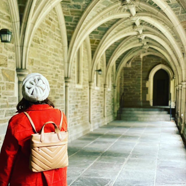
 I just love this picture ...  Princeton in the fall. Dreamy. 

Exploring NJ ... Again

Image
 We were long time New Jersey residents, so it's been fun to be back and taking time to re-explore places we used to spend a lot of time in.  Here's a few photos from two recent trips; to Hoboken and Princeton.  We lived in Hoboken for about 10 years. WOW. So it was exciting to drive the almost-two-hour ride to walk around and remember about all the crazy 20-year-old-just-out-of-college times we had.  Then there was an afternoon in Princeton catching up with friends. We all decided we're going to study at Princeton. It's magical. Kinda like Hogwarts. Sign me up!   How lucky to be back in familiar ground again. I just love living here. 

Three Colors All Lined Up!

Image
I am loving this view. Three rooms, all lined up, freshly painted in coordinating colors. And the cutest little dog.  Dining room: Village Green by Behr Hallway: Gossamer Veil by Sherwin Williams Living room: English Channel by Behr  I'm not great at a lot of things. But I'm darn good at picking colors. 

3 Podcasts I've Been Listening To Lately

Image
Between the neighborhood walks with Bruce and being alone in my house during the day when Dave is at the office and the girls are at school, I've been consuming a lot more podcasts than usual. And I've learned quite a LOT of interesting stuff.  Here are three podcasts that are on heavy rotation ...  Feel Better Live More from Dr. Rangan Chatterjee is a new discovery that I've been consuming a lot of, going into the archives to catch up on older conversations. He interviews interesting people and asks a lot of good questions. I just finished a long conversation about immunity, one on running, the myth of calories was excellent and the short sum-up on the Blue Zones, which I find crazy fascinating. It's great listening.  Smartless is a weekly favorite. I can almost get in the whole interview on my 20 minute walk with Bruce in the mornings. Or I'll finish the tail end while eating breakfast. It's silly and thoughtful. I like the banter between the guys -- Jason Bat

Foyer Color Change

Image
Light lime green isn't my color. And as of last week, it was the last not-my-color color in the house. But we had to wait a few months before the painter had an opening -- because I certainly was not getting on a ladder to paint the two-story foyer.  Here's the before photos, from the listing and a look at the ceiling ...  It's important to me that the colors in this house all coordinate, so I choose Gossamer Veil from Sherwin Williams -- that was a nice natural against the gray-green of the dining room and blue of the morning room. I think it turned out quite nice!  It feels more tranquil, serene and not as dirty or jarring when walking through this hallway now. And the best part ... I didn't get full of paint getting it done. Another thing done on our long list of updates for this lovely house.  Of course, my next thought is to replace the two chandelier lights with more modern colonial of my overall design plan. The smaller will be much easier, and less expensive, t

A Little Improvement in the Kitchen

Image
Our kitchen is a bit old and dated. The cabinets are dark and not in perfect shape. The oven is a disaster. I'm pretty sure the stove heats unevenly and the floor looks perpetually dingy.  Mostly, there's not much I can do about that. We'll likely remodel, but not for at least a year, possibly two. So I have to find little things I can do to make micro-improvements.  Enter the competing backsplash vs. counters.  The backsplash is a tumbled stone/travertine tile that's pink, salmon, orange, beige. And the counters are salmon, pink, beige marbled maybe-stone (?). Possibly granite circa early 1990? I can see how maybe someone thought they'd compliment but in reality they just fight for attention. In today's design, you usually pattern up one or the other. NOT BOTH.  Here's what we're working with...  I watched a number of quick youtube videos from DIYs are how SIMPLE it is to paint a backsplash. And cheap. Counters are less simple and cheap. So I went with