Isle of Pines in the Laundry Room

You know when there's a color you just want to TRY is some room? A hue seen on Pinterest so many times it just looks too good not to do. Well, I've always wanted a dark, energized green room. And I found the perfect place to try it.

Yup, the laundry room. Another house, another laundry room. This one is just as good as the last, and just as abused -- I've been jamming random stuff in all those cabinets for the last seven months with no rhyme or reason. 

Just as many good features as bad, too. I appreciate the white cabinets (that's a lot of storage) and sink for projects. We lock the dogs in here when we're out. But, I'm not a fan of the tight space, "vintage" washer/dryer and beige color. And the terracotta-ish tile floor was definetly slapped in here with missing grout.  
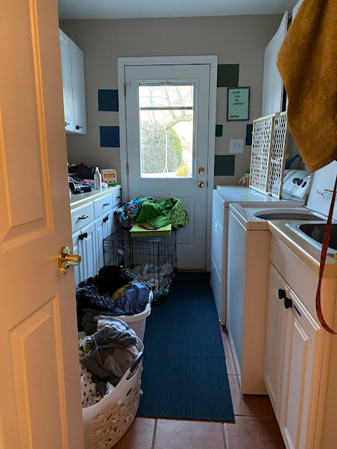

What's on tap for this room? Well, there's a HUGE organization project needed. And I already updated all the pulls from white plastic JUNK pulls to this fun, modern black pulls. They're a pop next to the white cabinets. 

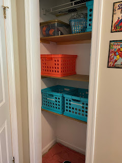
And I did redid the storage closet, removing the wire shelves and adding three extra-large shelves for more storage. You can read more here


So, let's get to the color ... 


Sherwin Williams Isle of Pines -- it's the perfect dark kelly green that isn't too avocado-y or mossy, but not too florescent or minty. I'm loving it. 


The first coat made me REALLY nervous, as all dark colors can do. But the final result was GORGEOUS, darling. 

I'm so lucky to have these rooms I can try all the colors I've always wanted to see on walls. This color is just as good as I was hoping. It works well with the white cabinets and biscuit-color counters. Did you even have a doubt?

Not much left to do in here until we change out the washer/dryer or update the countertop -- both big-ticket items that will need to wait for budgeting. 

Now ... how about another moody blue color? I've got an idea .... 


Related links:

All the laundry room projects 

Comments

Popular posts from this blog

Family Room: The Accent Wall

Wall: Before Ever since I started to think about decorating this house -- way back in October -- I knew I wanted to do a dramatic accent wall in the family room. The room is huge with two-story ceilings. There are six windows on one wall and four more flanking the fireplace -- so this room could definitely handle a dark, rich color. A few design magazine, sites and HGTV shows later, navy blue stuck in my head. Like one design show I watch advocates, look to the clothes you wear often to help decide color -- which for me and Dave is denim. And we both have soft navy sweatshirts that are common weekend wear. Navy it was -- decided in December. So, each night since we moved in while watching TV I'd stare at the beige wall, that is slightly inset, and imagine it was navy blue. And I'd itch and wish to paint it. Now, with the new media cabinet arriving on Friday, it's finally time! Once we moved out the furniture pieces we no longer will need, we reoriented everything ...

Top 5 Spots in Tenerife: La Ortava and Hotel Mencey

3. La Ortava A charming old town in the valley above Puerto de la Cruz. In my memory, it was green and lush, but in reality it's a small village populated by ancient buildings and nice locals. The Casa de los Balcones is a popular tourist spot to pick up local lace and your own little balcony. We walked up and down the hilly streets, and discovered two stunning public gardens and a nice coffee shop. We also watched fancy-dressed wedding guests entering an old church. The bride, I'm sorry to report, was very, very late. View Down a Twisty Street in La Ortava The Famous Tourist Trap - Casa de los Balcones  Jardin Victoria With Quite a View! 4. Hotel Mencey and Parque Garcia Sanabria In Santa Cruz, the small city we used as home base, we stretched our budget a little to stay at the historic Hotel Mencey. It was a comfortable, well-maintained hotel in a great location. I love a hotel will a lot of common spaces to relax in, and this one had a bunch, all with beaut...

Thinking Spring...

Thinking Spring ... and testing out this new collage photo editor . These are from last Spring. I was taking pictures of where the daffodils were coming up (for next Spring) when this cherubic creature stepped into the garden.