Posts

Showing posts with the label Paint

The Last Room to Paint

Image
Leah's room was the only one in the house I haven't painted since moving in. She liked the light grey color and didn't want me to bother with it. I hated the pale color and flat finish, plus all the pock marks from moving furniture, but I let it go.  Now that she's away at college, I have (nearly) free-rein on her room, and I have IDEAS!  First up, YES, paint!  I picked Smoky Azurite from SW . It's dark blue but with lots of grey undertones and gives the room a cozy yet active vibes. I immediately loved it. And it coordinates with the quilt and the grey in the curtains. Excellent.  The flat finish of the old paint soaked up the new paint so well that I had to do a second coat in most places -- even though I used the Emerald line of paint from SW, which usually only needs one coat. But that's how it goes with flat; it's an excellent primer.  Here's the desk wall in the old grey. If you could see all the holes and dirt, you'd understand why I was so ex...

Hello Green!

Image
 Like a fresh spring green, like the chairs at the Jardin Tuileries in Paris. Like the leaves of my Monstera plant. I'm deeply in love with Matcha Latte from Clare paint. I get a hit of oxytocin every time I walk through here.  Some early morning Sunday photos. This top one is filtered for max green impact! WOWZA! Just a few things about the color to review. I wanted to follow the same bright blue I have in the front room and in the cabinets. The old green wasn't the same temperature and felt dull in comparison. This green feels the same youthful, modern color. And with the new chairs, white wainscoting, black and beige accents in the rug and curtain. It all mixes for just the happy vibe I was aiming for.  I hope people come to my house for a dinner party, and never want to leave the dining room. 

No Surprise, I Choose Blue for Our Bedroom

Image
It was time to paint our bedroom. The flat gray was just too dull and the hue didn't work with our furniture. It's like matching grey pants with brown shoes -- fashion faux pas.  And, sure, I considered replacing all our furniture, it's a decade old and showing a little wear and tear. But quickly realized that it's just cheaper to paint out the gray. Though, I'm committed to switching out our upholstered headboard later this year.  Not to mention, there is a few places where we patched up the wall that needed to be painted over, and we don't have this gray paint from the former owners.  So, I went through all my color chips. Decided on blue. Picked a hue and ... no surprise ... it's about the same as the front room and the back hallway. Clearly, I have a favorite. Here's a few swatches I went through to decide on the blue. Some where too dark, too purple or too much gray in them.  I decided to leave the bottom part white, though I did look at a bunch of ...

Isle of Pines in the Laundry Room

Image
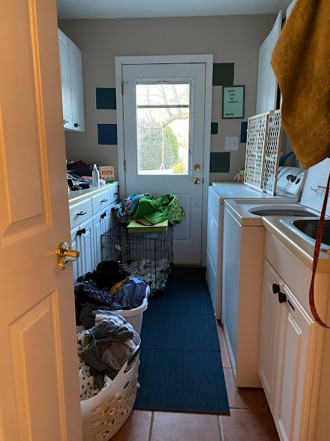
You know when there's a color you just want to TRY is some room? A hue seen on Pinterest so many times it just looks too good not to do. Well, I've always wanted a dark, energized green room. And I found the perfect place to try it. Yup, the laundry room. Another house, another laundry room. This one is just as good as the last, and just as abused -- I've been jamming random stuff in all those cabinets for the last seven months with no rhyme or reason.  Just as many good features as bad, too. I appreciate the white cabinets (that's a lot of storage) and sink for projects. We lock the dogs in here when we're out. But, I'm not a fan of the tight space, "vintage" washer/dryer and beige color. And the terracotta-ish tile floor was definetly slapped in here with missing grout.   What's on tap for this room? Well, there's a HUGE organization project needed. And I already updated all the pulls from white plastic JUNK pulls to this fun, modern black pu...

Basement Progress, Almost Done

Image
Basement painting rolls on ...  If you recall from the masterplan , there is the other half of the basement that needs paint and attention. So this weekend, that continued.  Here's the view from the bottom of the stairs to the right all painted and starting to be set up. The over-sized SoHo image (I worked around the corner from that building) and table are the snack, craft, area. You can catch a glimpse of the fridge area that will get a built-in cabinet next to it for a little kitchenette vibe.   Then you've got the other direction from the bottom of the stairs. The billiards area, that still needs to be painted. And dusted off, obviously. The mural stays and a hanging light needs to be found. (There's a reStore trip in my future ...)  And the LAST project of the basement will be this doozy ....  The stairs overhaul will be a BIG project on its own, but after some shopping around, I have a pretty good idea of what it will look like. I'll create a whole po...

Three Colors All Lined Up!

Image
I am loving this view. Three rooms, all lined up, freshly painted in coordinating colors. And the cutest little dog.  Dining room: Village Green by Behr Hallway: Gossamer Veil by Sherwin Williams Living room: English Channel by Behr  I'm not great at a lot of things. But I'm darn good at picking colors. 

Foyer Color Change

Image
Light lime green isn't my color. And as of last week, it was the last not-my-color color in the house. But we had to wait a few months before the painter had an opening -- because I certainly was not getting on a ladder to paint the two-story foyer.  Here's the before photos, from the listing and a look at the ceiling ...  It's important to me that the colors in this house all coordinate, so I choose Gossamer Veil from Sherwin Williams -- that was a nice natural against the gray-green of the dining room and blue of the morning room. I think it turned out quite nice!  It feels more tranquil, serene and not as dirty or jarring when walking through this hallway now. And the best part ... I didn't get full of paint getting it done. Another thing done on our long list of updates for this lovely house.  Of course, my next thought is to replace the two chandelier lights with more modern colonial of my overall design plan. The smaller will be much easier, and less expensive...

A Little Improvement in the Kitchen

Image
Our kitchen is a bit old and dated. The cabinets are dark and not in perfect shape. The oven is a disaster. I'm pretty sure the stove heats unevenly and the floor looks perpetually dingy.  Mostly, there's not much I can do about that. We'll likely remodel, but not for at least a year, possibly two. So I have to find little things I can do to make micro-improvements.  Enter the competing backsplash vs. counters.  The backsplash is a tumbled stone/travertine tile that's pink, salmon, orange, beige. And the counters are salmon, pink, beige marbled maybe-stone (?). Possibly granite circa early 1990? I can see how maybe someone thought they'd compliment but in reality they just fight for attention. In today's design, you usually pattern up one or the other. NOT BOTH.  Here's what we're working with...  I watched a number of quick youtube videos from DIYs are how SIMPLE it is to paint a backsplash. And cheap. Counters are less simple and cheap. So I went with ...

Loving This Blue Living Room

Image
It's the "front room" or the "living room" or the "morning room" or my "office" -- whatever we end up calling it, it's the room just opposite the dining room and nearest to the front door. It's the room I take my coffee to in the morning and stare out the window while I sip (it faces east). And where I sit all day while I'm working. It's an important, multifunctional room.  So, it was the obvious choice for the next makeover. Here's what it looked like when we bought the house. Clearly, it was used as a "formal" space. The room only guests got to enter -- which let's all agree is an outdated construct, ok? Then we moved in and it looked like this ..   Curtains came down and our well-used sofas came in. Quickly turned into a multi-use room. But that red accent wall and tan had to be updated. I put up many paint chips on the wall with the guidelines that: it had to coordinate with the dining room and foyer, it ...

Red Walls Be Gone

Image
I am not against a red wall or even an accent wall. Far from it. And I'm sure the previous owners of this house were really excited about the red wall. So great for them.  But for me, not so much. The brassy red tone with the brown/tan walls just felt like a lot of visual noise to me. So, it had to go ... first!  When you have a very dark wall, it needs to be primed first. So after work last week, I put a layer of primer on it. And even that made me feel a lot less chaotic.    And primed ...  I'm so excited to start with our color. I really wanted a gray-green tone in this dining room -- I don't know why, it just felt like the right direction. With the white lower half continued around the whole room.   Here's the first coat on that wall. The colors are Behr's Village Green and the white is Behr's Whisper White .   The color is absolutely amazing. I love it!  No matter how many rooms I paint I will never ever get over the impact a new ...

Little Dresser Painting Project

Image
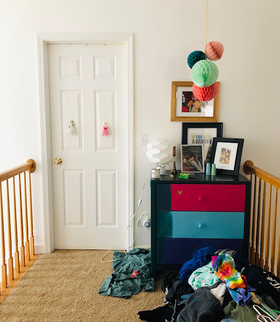
If I haven't gotten a paint brush in my hand and totally transformed a space/furniture for a while, I get the shakes. That's just how much I love painting things! Love it. So this weekend, while I'm still trying to re-balance and figure out how I'm going to do all the house projects in the abbreviated time I now have with a full time job, I made all effort to paint something. Anything! And this little dresser, which I see every day on the second floor landing, was just the perfect candidate. The story of this dresser goes waaaay back to California, when we were single and living in a small apartment in the Bay Area. We drove to Ikea near Berkeley and bought a new wood dresser set; this little three-drawer dresser has a taller counterpart. Right around the time Leah was born, we painted it a very dark grey (it quickly chipped and was sticky -- my first lesson in the type of paint to use on furniture). And in this house, it was needed in Alice's room so I bought...

Curly Willow to Pearly Cotton in the Master Bedroom

Image
I'm not saying the willow color on the walls of my master bedroom was a mistake, it just didn't go the way I thought I would. So this week, I'm fixing it. Let's rewind. In 2015, we had professional painters come and paint the two-story walls from awful beige to "polar bear" (by Behr) white ( see that post )! While here, I got a quote for the master bedroom and a year later they came back to change the original dirty, mint green to blue. Here's the post and a very dark picture of the walls . Yup, I love painting walls but I was working a lot and the room is huge, so I didn't think I could get it done in a weekend. I hired it out. Go me! The walls in the master have an angled part , so I used this dark beige-y brown color called "curly willow" to match with the duvet cover and wheat-color headboard. But when I saw it, I knew I went the wrong direction. So, for the past three years, I've been looking at it and kinda liking it. But ...

Not Navy Enough?

Image
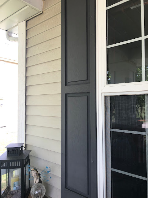
We have three sets of shutters on our house that probably haven't been touched since they were installed 20ish years ago. This weekend we finally got around to painting them -- a project that's been on our TO DO list for, oh, five years. We picked the shade "inked" by Behr because I love navy and wanted it to be dark and moody. But I'm not sure that's what I got ... Here's the Shutter on the Ground Floor BEFORE AFTER: "Inked" Shutter  The color went on super bright blue, but it seemed to darken as it dried. So I went from feeling so-so, to thumbs-up. Then, Dave crawled out of a bedroom to paint the shutters on the upper level. You can see the "before" on the windows to the left, and the "after" on the right. I am not completely sold on them and I think it's because either a) I'm not used to seeing a pop of color on my house or b) I simply don't like the color. I'm giving it a week to deci...