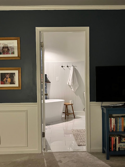
Our Bathroom Is Done
Completely forgot to post the final bathroom pictures. We're so pleased about the way it turned out. And the room feels so much larger
First, this might be the most important view. It's what I see from bed while I'm reading at night. Before it was super ugly, especially when I put paint samples up on the wall. And the terrible tile around the huge tub and all the junk we put on it. Isn't this dreamy?!
And here's the tub accent wall with the new light, ledge and the gleaming shiplap painted with water-friendly paint.
Before I forget, the paint color on the shiplap is SW Fleur de Sal and wall is SW Greek Villa. The floor is a cheap porcelain tile and this star tile is from Home Depot.
The blue tile in the shower is the one thing I would change. I love the dark blue but if I had another go, I'd pick the denim color I looked at. OR a white tile to really brighten the room.
On the other hand, I'm so glad I used the same vanity and mirror/lights. I'm so looking forward to when we swap them out for a beautiful oak vanity and other lights ... but, at the same time, I also can wait because renovations are so disruptive.
Yay!


Comments
Post a Comment