
File this as another upcycle art project that I'm so fond of these days. With the Paris move, I'm looking for ways to get things OUT of my house. Some things I'm just tossing, but if it's usable material, I'm going to use it.
So you know those paint chips AKA "color samples" you collect at the hardware store? Well, as I've painted every room of this house, I have about a million. Maybe billion. And they're all such pretty colors, of course. This summer, Leah brought home a little mosaic art project that used these paint chips and I thought, how genius! What a great way to put those little, colorful paper to use.
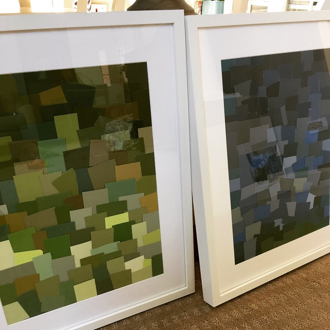
Voila ... I created these ...

I had these largish white frames that I picked up at IKEA. (I'm pretty sure it's impossible to go to IKEA without buying frames, there might be a way, but I haven't found it.) And I decided to use them to replace the two very old boxwood wreathes above my mantel in the family room.
Obviously, I have a ton of green and blue samples, since those are my favorite colors and what I used in the family room. Perfect-o.
I turned on a podcast ("The New Paris," in case you're wondering), and started clipping and glueing away.
The funny thing is, I've been into collaging since high school, so the skill of arranging by color and sizes is nothing new to me.
I'm pretty excited about how they turned out. SO excited I bought two more frames from Michaels (at 50% off ... again, you can't leave Michaels without 50% off items ... not possible) and am excited to try a new color direction.
Yes, this week I'm feeling like an artist!
Related posts:
All my "reuse" posts
So you know those paint chips AKA "color samples" you collect at the hardware store? Well, as I've painted every room of this house, I have about a million. Maybe billion. And they're all such pretty colors, of course. This summer, Leah brought home a little mosaic art project that used these paint chips and I thought, how genius! What a great way to put those little, colorful paper to use.
Voila ... I created these ...
I had these largish white frames that I picked up at IKEA. (I'm pretty sure it's impossible to go to IKEA without buying frames, there might be a way, but I haven't found it.) And I decided to use them to replace the two very old boxwood wreathes above my mantel in the family room.
Obviously, I have a ton of green and blue samples, since those are my favorite colors and what I used in the family room. Perfect-o.
I turned on a podcast ("The New Paris," in case you're wondering), and started clipping and glueing away.
 |
| Chips and More Chips |
 |
| Green Chip Art |
Yes, this week I'm feeling like an artist!
Related posts:
All my "reuse" posts
Comments
Post a Comment